Outlook - Redesign automated email template
Problem: Automated emails look unprofessional. The black-and-white dashed frame around the email is disliked, and the “Voir facture” button has blue text on dark green, which is hard to read.
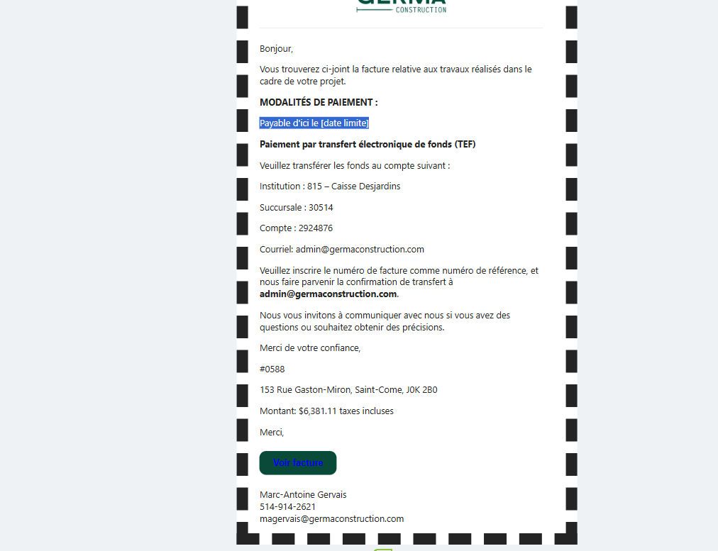
Request: Remove the dashed frame (replace with a plain background) and fix button contrast to meet readability standards.
Log in to comment and vote
No comments yet
Be the first to share your thoughts.